Choosing Colors, Finding Confidence
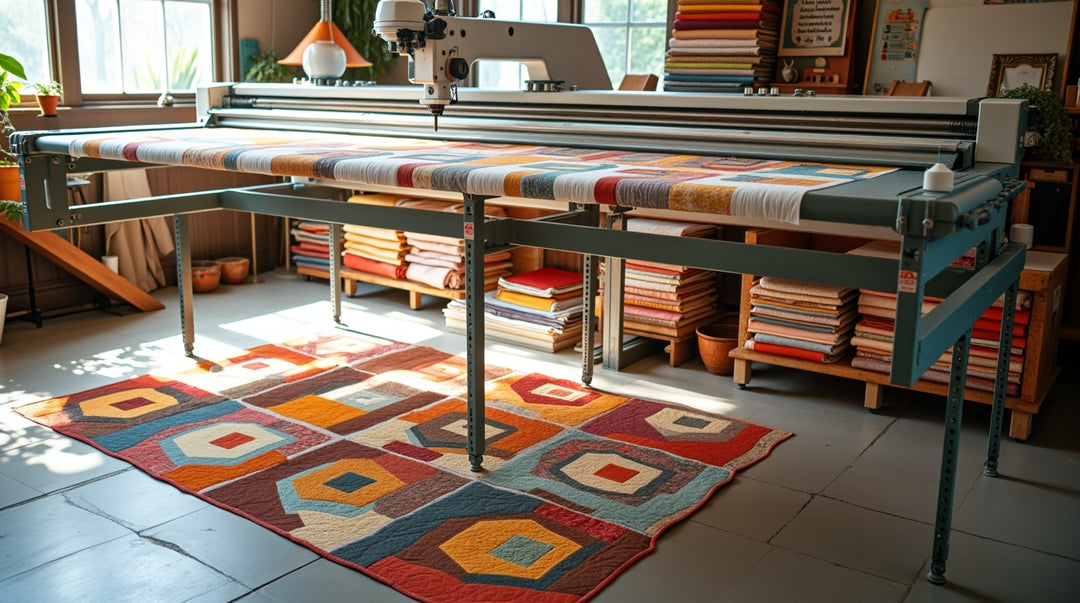
Ask any writer (myself included) and they’ll tell you the most frightening part of a project is staring at the blank page, wondering where the journey begins. The sea of white on an empty page is both a blessing and a curse; the possibilities are endless, but they are also without form or reason. Luckily, the quilt book Tracy sent me gives me a place to start my quilting journey rather than beginning with a truly blank canvas. I chose the Coin Flip pattern, which is constructed entirely of rectangles. It is featured in the book Just One Charm Pack Quilts by Cheryl Brickey.

For this particular quilt, I chose the A Cat Called Stitch charm pack by Moda. The entire collection appealed to Erin and me the first time we saw it in the Moda Fall 2025 catalog. The colors remind us of the month of May and the glory of late spring. It felt like the perfect place to start.
The tough part is deciding which solids to pair with the charm pack. The example in the  book has a deep purple accent block and purple edging with a white background. I searched online to find other examples, but what I found were similar choices. I tend to gravitate toward color rather than neutrals. True to form, Erin is the opposite and loves neutrals more. That contrast between us made me realize I needed to think about color theory.
Color Theory
Color theory gives quilters a simple way to understand why certain fabrics feel harmonious while others clash. At its heart, it is about relationships. Colors that sit side by side on the color wheel, like greens and blues, create a calm and natural palette. Opposites, such as yellow and purple, bring contrast and energy. Neutrals act as anchors, giving the eye a place to rest and allowing brighter prints to shine. Thinking about these relationships helps transform a pile of pretty fabrics into a quilt with intention, balance, and movement.
The Heart of the Quilt
I want my quilt to sing the song of spring, so colors are important. But I also believe it will be complicated to place so many colors and patterns together without using a neutral to ground the prints and allow the florals to shine through.
In the end, I’ve decided to hold off until my next shipment of Moda Thatched neutrals comes in. I have an off-white that I think will bind it all together beautifully. I won’t know for sure until I see the fabrics side by side. In the meantime, I’ve prepared my strips and will use a dark blue as the accent and edging for contrast. The color will be deeper than the blue in the collection but should not clash.
In many ways, this project feels a lot like that blank page I mentioned at the beginning. The colors, the patterns, the choices all become the first brushstrokes on a new creative canvas. Quilting asks us to trust the process, to listen to what the fabric is telling us, and to let the pieces come together in their own time. That is what makes it so special. Each quilt begins as a stack of possibilities and slowly becomes something warm, comforting, and full of meaning. I look forward to sharing the next steps as this one takes shape, and I hope you will follow along as we learn, experiment, and stitch our way into spring.
If you are in the downtown area over the next few weeks, stop by and let me know what you think. I always welcome compliments and constructive criticism. It’s the only way we learn new things and grow.
Thank you for supporting Pisgah Needleworks and shopping local! Happy stitching!


Leave a comment